HOW TO DRAW A REALISTIC IMAGE IN PHOTOSHOP - Part I
Article by Irene Laschi
STEP 1: Outlines
Open the path window and using the pen start tracing paths on the outline of the image.
Create paths for the general outline, for different color areas, for different elements and details and save them; you can create your paths on different path layers or on the same one, because you can select the one you need each time with the direct selection tool.
Using paths allow you to have very well defined zone and outlines, you couldn’t obtain that so easily working directly with brushes (unless you have a Cintiq and/or you’re experienced in digital drawing).
You can trace paths even in Illustrator and then import them in Photoshop.
STEP 5: Lights
Create a new layer above.
Using a regular soft brush (if the surface is regular) or otherwise an irregular soft one (decreasing its opacity and its flow to have a better control), start painting the light areas.
Lights aren’t only white, so you can choose even different pale colors to make them.
If you need to work only on a certain area, use the path you made (STEP 1) to create the selections.
You can use both Normal mode and Lighten modes, especially Overlay (to create much vibrant and intense lights) and Soft Light (to create very soft tones).
Putting each color on a different layer you can have a better control on the intensity of the single lights and on the way they play together.
Creating a group from these light layers allows you to control the whole layers as they were one (as it happened with textures in STEP 3).
Adding a layer mask to the group let you to change all the contents in a reversible mode.
STEP 6: Reflected light
Each element receive light even from near elements, and their colors spread on the element you’re watching, producing the so-called reflected light.
To add reflected light to your element (in this case, the cherry) you have to choose a color close to the one of the nearest object (in this case, the leaf) and add it with a soft brush on the edge near to that object (in this case, the right edge).
You can use layer in Color blending mode if you add this tone to an already lighten area or Soft Light if you have to light up a dark one.
You can always adjust the color with hue/saturation/brightness.
To add reflected light to the cherry I chose the same green I used to fill the leaf and the stem. Working on the edge close to the leaf an in the area near the stem, I added the color with a soft brush on a new layer (Color mode).
Now the cherry it’s done, feel free to ask if you have any question!
I’ll explain how to color the leaf on my next post, HOW TO DRAW A REALISTIC IMAGE IN PHOTOSHOP - Part II
Last week I talked about digital coloring in Photoshop, this week I'll explain how to draw and color a realistic illustration using Photoshop only.
I wrote this tutorial few years ago for the magazine Advanced Photoshop Germany; to draw both the tutorial illustration and the other illustrations of the article I used Photoshop CS3 and a Wacom Bamboo tablet.
You can see all the illustrations I made here.
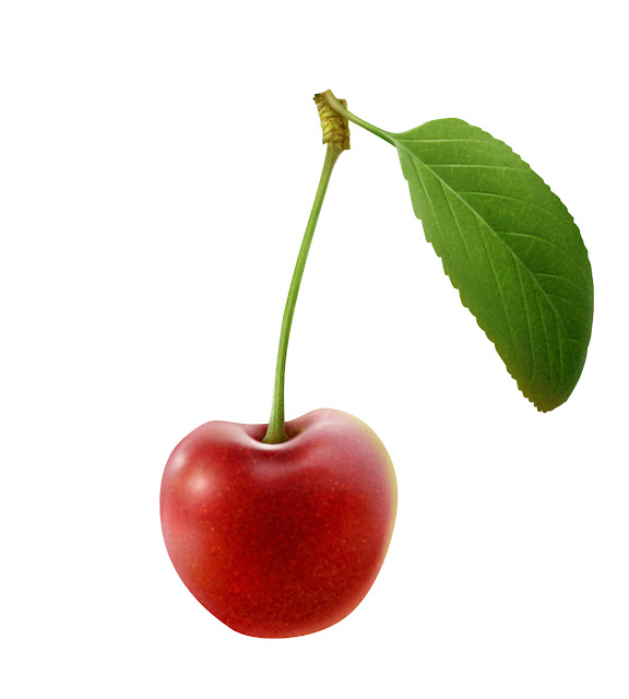
For tutorial, I chose a cherry, because I like the way the light reflects on the surface and the simple structure of its leaf, but you could follow this tutorial to draw anything you want.
STEP 0: Preparing the canvas
Open a new document in Photoshop; insert the right dimensions at 300dpi (if you want to print the illustration in a second moment, otherwise choose the most suitable resolution depending on the final usage).
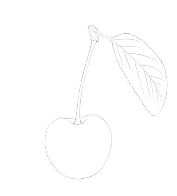
For the cherry I decided to work on a 9x13cm canvas at 300dpi, so that the final illustration of the cherry would be bigger than a real fruit and you could appreciate the texture of the peel and of the leaf.
Draw the cherry outlines or import on this file a sketch you made on paper.
STEP 1: Outlines
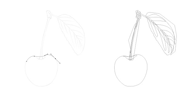
Open the path window and using the pen start tracing paths on the outline of the image.
Create paths for the general outline, for different color areas, for different elements and details and save them; you can create your paths on different path layers or on the same one, because you can select the one you need each time with the direct selection tool.
Using paths allow you to have very well defined zone and outlines, you couldn’t obtain that so easily working directly with brushes (unless you have a Cintiq and/or you’re experienced in digital drawing).
You can trace paths even in Illustrator and then import them in Photoshop.
STEP 2: Flat colors
Create a new layer, Normal blending mode, layer opacity and layer fill 100%, and call it with the name of the color or of the object.
Create different layers for different colors.
Choose the foreground color and with the direct selection tool select the path you want to fill in, choosing the option “fill path with foreground color” from the cascade menu (right click). Repeat the action for each color on the proper layers.
You can adjust the color opening the hue/saturation/brightness window in every moment.
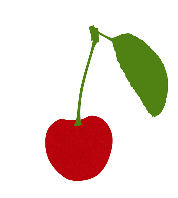
I created two layers, one for the fruit and one for the leaf and the stem; I filled the first one with red and the second one with green.
STEP 3: Textures
Open some photos of the same subject (not only the one you used for the illustration): in this way you can study surfaces and textures and decide which colors you want to use and what kind of result you want to reach.
Create a group above the flat color layer: you’re going to put your textures layers into it.
Using this strategy you can work with different blending modes and different opacity within the same group: once you find the perfect combination instead of merging the textures layers and choosing again a blending mode you can directly choose the blending mode of the group.
You can add a layer mask to the group and with the erase tool (with white in the foreground and black in the background) you can delete the texture in a reversible mode where you don’t want to see it.
Usually, if you want to add dark texture you should use darken blending mode (Multiply, Color Burn, etc.), if you want to add light points you should invert the texture and use lighten blending mode (Lighten, Screen, etc.).
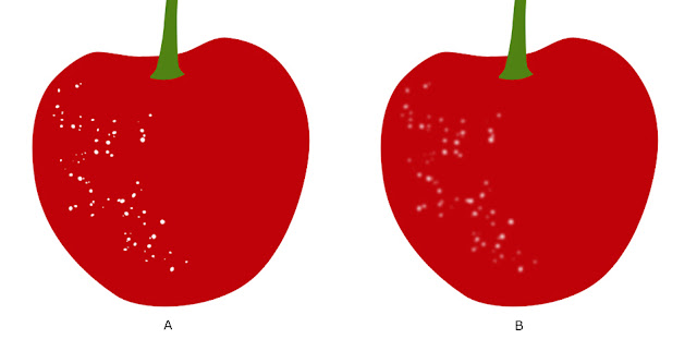
To create the cherry texture, I used custom hard Photoshop brush and changed its shape dynamics and scattering (>Brush window).
Once created the texture (A), I added a little blur (>Filter >Blur) (B).
I created a light texture (Overlay mode) and a dark one (Multiply mode), within the same group over the flat color layers. I adjusted both single layers opacity and group opacity.
Changing brushes, and using for example a watercolor or a pencil brush, you can also vary colors a bit, adding, for example, hints of orange or dark red on the cherry surface.
I added a layer mask to the group and erased with a soft erase the texture in some areas.
STEP 4: Shadows
Create a new layer above, in a Darken blending mode (usually I use Multiply, Color burn or Linear burn).
Select the area you’re going to work in and fill it with a plain color: you have to choose a darker, cooler and more desaturate color than the one you used for the flat colored layer (STEP 2).
If it’s too dark, you can decrease its opacity.
Then add a layer mask and choose a soft erase – you can choose a default erase or change its settings within the brush window, you can also play with its opacity and its flow, then start erasing the shadow where you don’t need it.
If you prefer, once created the new layer instead of filling it with a color and then erase it you can add color with a soft brush or using the gradient tool.
I created a deep red layer above the cherry one, Color burn mode, using a layer mask and the erase tool as described above.Open some photos of the same subject (not only the one you used for the illustration): in this way you can study surfaces and textures and decide which colors you want to use and what kind of result you want to reach.
Create a group above the flat color layer: you’re going to put your textures layers into it.
Using this strategy you can work with different blending modes and different opacity within the same group: once you find the perfect combination instead of merging the textures layers and choosing again a blending mode you can directly choose the blending mode of the group.
You can add a layer mask to the group and with the erase tool (with white in the foreground and black in the background) you can delete the texture in a reversible mode where you don’t want to see it.
Usually, if you want to add dark texture you should use darken blending mode (Multiply, Color Burn, etc.), if you want to add light points you should invert the texture and use lighten blending mode (Lighten, Screen, etc.).
To create the cherry texture, I used custom hard Photoshop brush and changed its shape dynamics and scattering (>Brush window).
Once created the texture (A), I added a little blur (>Filter >Blur) (B).
I created a light texture (Overlay mode) and a dark one (Multiply mode), within the same group over the flat color layers. I adjusted both single layers opacity and group opacity.
Changing brushes, and using for example a watercolor or a pencil brush, you can also vary colors a bit, adding, for example, hints of orange or dark red on the cherry surface.
I added a layer mask to the group and erased with a soft erase the texture in some areas.
Create a new layer above, in a Darken blending mode (usually I use Multiply, Color burn or Linear burn).
Select the area you’re going to work in and fill it with a plain color: you have to choose a darker, cooler and more desaturate color than the one you used for the flat colored layer (STEP 2).
If it’s too dark, you can decrease its opacity.
Then add a layer mask and choose a soft erase – you can choose a default erase or change its settings within the brush window, you can also play with its opacity and its flow, then start erasing the shadow where you don’t need it.
If you prefer, once created the new layer instead of filling it with a color and then erase it you can add color with a soft brush or using the gradient tool.
STEP 5: Lights
Create a new layer above.
Using a regular soft brush (if the surface is regular) or otherwise an irregular soft one (decreasing its opacity and its flow to have a better control), start painting the light areas.
Lights aren’t only white, so you can choose even different pale colors to make them.
If you need to work only on a certain area, use the path you made (STEP 1) to create the selections.
You can use both Normal mode and Lighten modes, especially Overlay (to create much vibrant and intense lights) and Soft Light (to create very soft tones).
Putting each color on a different layer you can have a better control on the intensity of the single lights and on the way they play together.
Creating a group from these light layers allows you to control the whole layers as they were one (as it happened with textures in STEP 3).
Adding a layer mask to the group let you to change all the contents in a reversible mode.
STEP 6: Reflected light
Each element receive light even from near elements, and their colors spread on the element you’re watching, producing the so-called reflected light.
To add reflected light to your element (in this case, the cherry) you have to choose a color close to the one of the nearest object (in this case, the leaf) and add it with a soft brush on the edge near to that object (in this case, the right edge).
You can use layer in Color blending mode if you add this tone to an already lighten area or Soft Light if you have to light up a dark one.
You can always adjust the color with hue/saturation/brightness.
To add reflected light to the cherry I chose the same green I used to fill the leaf and the stem. Working on the edge close to the leaf an in the area near the stem, I added the color with a soft brush on a new layer (Color mode).
Now the cherry it’s done, feel free to ask if you have any question!
I’ll explain how to color the leaf on my next post, HOW TO DRAW A REALISTIC IMAGE IN PHOTOSHOP - Part II
Stay tuned!



Questo articolo è molto interessante 😍
ReplyDeleteGrazie mille Azzurra! Se provi a colorare un'illustrazione seguendo questi passaggi fammi sapere come ti sei trovata e se sei soddisfatta del risultato.
DeleteLa prossima settimana spiegherò come colorare la foglia!
This is really nice and complete tutorial. I gotta try this!
ReplyDeleteThank you! Next week I'll explain how to color the leaf too.
DeleteIf you try it, let me know if you are happy with the result :)
Feel free to send it to my email (therebelcaterpillar@gmail.com) if you want a feedback!
I use this way of drawing and coloring to create food illustrations too - combining different textures you can easily draw biscuits, garnishes, etc.