CASE STUDIO: PORTRAITS - Part II
Article by Irene Laschi
PART II: THE WORK IN PROGRESS
The features I love most in Metlicovitz and Duncan artworks are for sure the limited color palette and the contrast between realistic and flat areas.
I started from that to plan my illustrations.
The color palette
I know that softwares like Illustrator or Procreate could show you suggested color palettes, but I wanted something more personal (and I'm too old school to use them).
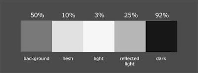
I started defining the values, to have the right contrast between light and dark:
Then I chose specific colors for each girl, according to values above.
I wanted a nice balance between warm and cool colors:
The drawing and the coloring process
I started with outlines (1), then added flat colors (2), main shades (3), shadows (4), reflected lights (5) and lights (6) - as I always do when working in Photoshop (and not only in Photoshop, see following paragraphs).
I paid attention to having different colors on different layers - like in old chromolitography, each color should stay separate from each other.
Extra details, like piercings, were added in a second time.
Photoshop offers a lot of brushes, but actually I never use more than 5 /10 of them (and I eventually create new ones when needed).
In this specific case I just used the custom pencil brush to add shadows and a soft erase.
I worked as I would have done on paper with colored pencils, like I did in these old sketches of mine:
Just few notes about my approach to digital drawing and coloring.
Photoshop, like any other drawing software, is just a media - not something that draw illustrations in your place or solve your problems if you don't know how to solve them.
It helps a lot, and it makes things easier and quicker, but you should know how to do those things.
Steps I made in Photoshop are the same I'd have made with traditional media when drawing portraits:
1 = outlines with pencil
2 = flat colors with airbrush, using transparent or opaque colors (depending on background color)
3 = main shades with airbrush
4, 5, 6 = detailed shadows and lights, added with colored pencils and/or gouache
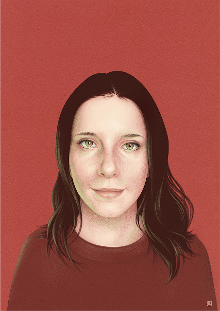
The final results
If you missed the previous post, about my sources of inspiration, you can find it here:
PART I: THE INSPIRATION
Thanks for your attention, I do hope it was an useful reading!
If you want, leave a comment or a feedback, ask if you have any question or let me know what you would like to read in the next posts!


Sono davvero interessanti le palette che hai usato per queste illustrazioni. Avrei una domanda sullo sfondo... Come hai fatto a riprodurre la grana della carta? Grazie in anticipo ❤️
ReplyDeleteCiao Azzurra, ho utilizzato delle scansioni di fogli di carta colorata, nello specifico Daler-Rowney Murano e Canson Mi Teintes: hanno una texture piuttosto visibile e simile alla carta da acquerello.
DeleteMi piaceva il contrasto di questa grana con le tinte piatte usate per volti e capelli!