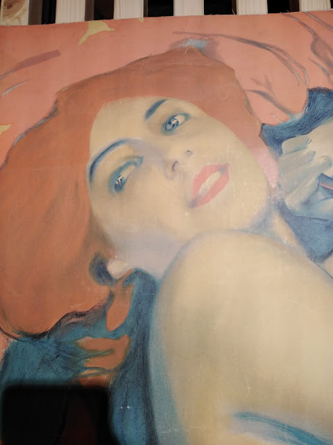
CASE STUDIO: PORTRAITS - Part I
Article by Irene Laschi
PART I: THE INSPIRATION
What's behind a project like PORTRAITS?
I've always loved drawing portraits, but I've always used traditional media on paper or digital ones that simulates them, like I did in this project.
I had 4 exceptional models (my students Alessia, Susanna, Azzurra e Letizia) and I wanted to explore new way of drawing and coloring portraits in Photoshop.
The inspiration came from two different past artists I've recently discovered: the illustrator Leopoldo Metlicovitz (Trieste 1868 - Ponte Lambro 1944) and the painter John Duncan (Dundee 1866 - Edinburgh 1945).
They're not related to each other, but they worked in the same period - the years of the Art Nouveau.
Leopoldo Metlicovitz
I've been studying traditional printing methods and I'm obsessed with chromolithography, the printing method used for late 19th century advertising posters, like the ones made for Moulin Rouge by Toulouse-Lautrec.
To create colored images, each color is printed above the other(s) using a different stone slab or metal plate.
Metlicovitz was a pioneer of poster art in Italy: he was both a painter and a lithographer, and looking at his posters his knowledge of printing methods is evident.
Last month I had the chance to see the awesome exhibition "Metlicovitz. L'arte del desiderio" (Museo Nazionale Collezione Salce, May 16th - Nov 10th), and I was impressed in particular by L'ora and Turandot.
What I liked most in these two artworks:
John Duncan
His artworks could be ascribed to Celtic revival movement in Scotland and to Symbolism.
I had the chance to admire one of his masterpiece, St. Bride, at the Scottish National Galleries while I was on holiday in Edinburgh.
What I liked most:
How could this inspiration be used in an illustration?
Without copying these artists, how could these features be turned in something more personal?
All my answers next week (Dec 9th) in PART II: THE WORK IN PROGRESS
Stay tuned!
If you want, leave a comment or a feedback, ask if you have any question or let me know what you would like to read in the next posts! Thank you!
PART I: THE INSPIRATION
What's behind a project like PORTRAITS?
I've always loved drawing portraits, but I've always used traditional media on paper or digital ones that simulates them, like I did in this project.
I had 4 exceptional models (my students Alessia, Susanna, Azzurra e Letizia) and I wanted to explore new way of drawing and coloring portraits in Photoshop.
The inspiration came from two different past artists I've recently discovered: the illustrator Leopoldo Metlicovitz (Trieste 1868 - Ponte Lambro 1944) and the painter John Duncan (Dundee 1866 - Edinburgh 1945).
They're not related to each other, but they worked in the same period - the years of the Art Nouveau.
Leopoldo Metlicovitz
I've been studying traditional printing methods and I'm obsessed with chromolithography, the printing method used for late 19th century advertising posters, like the ones made for Moulin Rouge by Toulouse-Lautrec.
To create colored images, each color is printed above the other(s) using a different stone slab or metal plate.
Metlicovitz was a pioneer of poster art in Italy: he was both a painter and a lithographer, and looking at his posters his knowledge of printing methods is evident.
Last month I had the chance to see the awesome exhibition "Metlicovitz. L'arte del desiderio" (Museo Nazionale Collezione Salce, May 16th - Nov 10th), and I was impressed in particular by L'ora and Turandot.
 |
| L'ora, 1910 |
 |
| L'Ora, 1910 - detail |
 |
| Turandot, 1926 |
 |
| Turandot, 1926 - detail |
- The use of a limited color palette (mainly due to printing method in this case)
- The color contrasts: warm vs cool in L'ora, saturated vs desaturated in Turandot, dark vs light
- Realistic faces and figures vs flat elements (hair, backgrounds, clothes)
- The use of reflected light, especially in Turandot
John Duncan
His artworks could be ascribed to Celtic revival movement in Scotland and to Symbolism.
I had the chance to admire one of his masterpiece, St. Bride, at the Scottish National Galleries while I was on holiday in Edinburgh.
What I liked most:
- Realistic faces and figures vs flat elements (hair, clothes)
- Soft shadings on realistic areas
- Limited and warm color palette on faces and hair
How could this inspiration be used in an illustration?
Without copying these artists, how could these features be turned in something more personal?
All my answers next week (Dec 9th) in PART II: THE WORK IN PROGRESS
Stay tuned!
If you want, leave a comment or a feedback, ask if you have any question or let me know what you would like to read in the next posts! Thank you!


Comments
Post a Comment