Posts

HOW TO DRAW A REALISTIC IMAGE IN PHOTOSHOP - Part II

Image
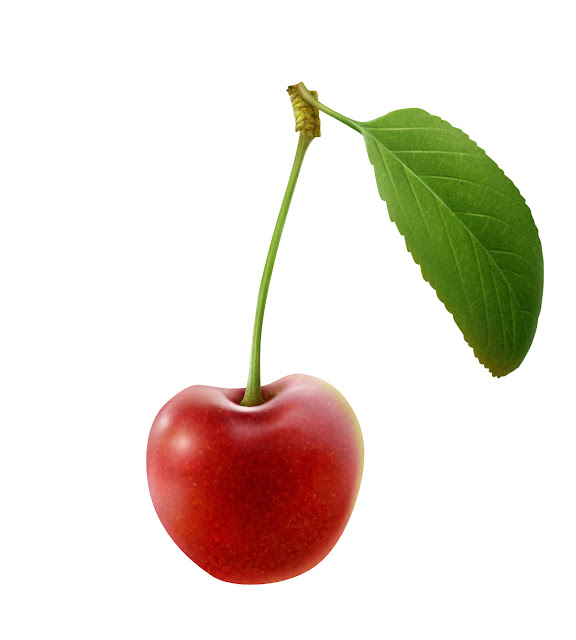
Article by Irene Laschi  This week I'll explain how to draw the leaf and finish the Cherry illustration. STEP 7: Adding shadows on the leaf Create a layer, Multiply mode, above the others. Selecting the paths I made for the leaf veins, create a selection (right click: anti-alias on, 0 px feather) and start working on this new layer with a very soft brush (low opacity and flow as always). I created more than one layer (one layer = one color) within a group to find the perfect balance between generic shadows and specific shadows on the leaf, using dark green and a blue-green. Deselecting and adding a layer mask to the group, erase with a soft erase tool the areas that seem too intense. STEP 8: Adding texture To enhance the realistic effect, I used a custom Photoshop effect to create little veins between the main ones. In this specific case I chose the Bevel and Emboss effect, changing its default settings to obtain the wanted result (it had to seem very natural).

HOW TO DRAW A REALISTIC IMAGE IN PHOTOSHOP - Part I

Image
Article by Irene Laschi  Last week I talked about digital coloring in Photoshop, this week I'll explain how to draw and color a realistic illustration using Photoshop only. I wrote this tutorial few years ago for the magazine Advanced Photoshop Germany; to draw both the tutorial illustration and the other illustrations of the article I used Photoshop CS3 and a Wacom Bamboo tablet. You can see all the illustrations I made here . For tutorial, I chose a cherry, because I like the way the light reflects on the surface and the simple structure of its leaf, but you could follow this tutorial to draw anything you want. STEP 0: Preparing the canvas Open a new document in Photoshop; insert the right dimensions at 300dpi (if you want to print the illustration in a second moment, otherwise choose the most suitable resolution depending on the final usage). For the cherry I decided to work on a 9x13cm canvas at 300dpi, so that the final illustration of the cherry would be big

DIGITAL COLORING IN PHOTOSHOP

Image
Article by Irene Laschi How could a chiaroscuro drawing made on paper be colored in Photoshop? I asked myself this question when I started drawing illustrations as a professional illustrator, more than 10 years ago. I was used to draw both colored and black and white drawings with traditional media on paper, but I wanted to learn different solutions, using digital media too. Rather than starting with digital paintings I tested a mixed media: handmade drawing on paper + digital coloring. I drew these illustrations for Citizen K magazine some years ago, and they are a good example of this mixed media. The following tutorial is the method I used in this specific case, and I consider it my standard one.  It's really easy, but of course it's not the only possible one. If you want to try, you just need a good monochromatic drawing, a scanner, Adobe Photoshop (even old versions are ok, I used CS3 for ages and now I'm using CS6) and a graphic tablet (a Wacom Bamb

CASE STUDIO: PORTRAITS - Part II

Image
Article by Irene Laschi PART II: THE WORK IN PROGRESS The features I love most in Metlicovitz and Duncan artworks are for sure the limited color palette and the contrast between realistic and flat areas. I started from that to plan my illustrations. The color palette I know that softwares like Illustrator or Procreate could show you suggested color palettes, but I wanted something more personal (and I'm too old school to use them). I started defining the values, to have the right contrast between light and dark: Then I chose specific colors for each girl, according to values above. I wanted a nice balance between warm and cool colors: The drawing and the coloring process I started with outlines ( 1 ), then added flat colors ( 2 ), main shades ( 3 ), shadows ( 4 ), reflected lights ( 5 ) and lights ( 6 ) - as I always do when working in Photoshop (and not only in Photoshop, see following paragraphs). I paid attention to having different colors on differ

CASE STUDIO: PORTRAITS - Part I

Image
Article by Irene Laschi PART I: THE INSPIRATION What's behind a project like PORTRAITS ? I've always loved drawing portraits, but I've always used traditional media on paper or digital ones that simulates them, like I did in this project . I had 4 exceptional models (my students Alessia, Susanna, Azzurra e Letizia) and I wanted to explore new way of drawing and coloring portraits in Photoshop. The inspiration came from two different past artists I've recently discovered: the illustrator  Leopoldo Metlicovitz (Trieste 1868 - Ponte Lambro 1944) and the painter John Duncan (Dundee 1866 - Edinburgh 1945). They're not related to each other, but they worked in the same period - the years of the Art Nouveau. Leopoldo Metlicovitz I've been studying traditional printing methods and I'm obsessed with chromolithography, the printing method used for late 19th century advertising posters, like the ones made for Moulin Rouge by Toulouse-Lautrec. To c